Passion Partners is a new professional marketing agency on Russian market. A young and highly qualified team with ambitions to change the market by introducing new international standards and the most progressive approach.
The concept of visual identity redesign is built on a combination of flexibility of high-quality customer service, based on partnerships, and clarity of consulting which allows to build efficient processes.
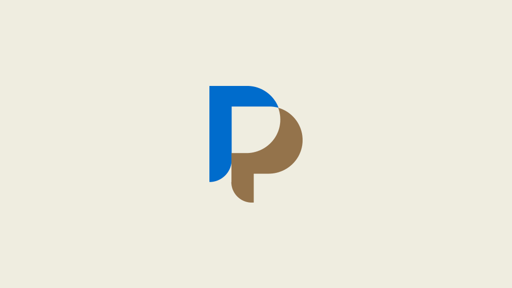
The logo consists of two merging and complementary letters “P”, referring to the name of the company, but at the same time demonstrating close partnership and cooperation.
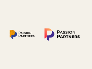
The sign shows a symbolic image of dialogue clouds, a key symbol of partnership and the ability to listen and understand the client.
The identity itself is also made very flexible in use. Dozens of color combinations have been developed to adapt a brand to the color scheme of each client or an event in which the company participates.
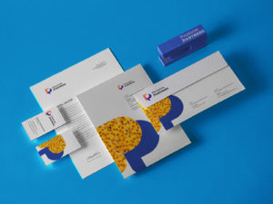
Due to this solution, in the entire corporate identity, the emphasis is on the main logo, which itself is an element of graphic design.
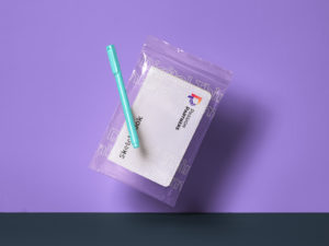
Documentation and any brand materials look clean and will never get lost among documents and materials from other companies.
For less formal use, the logo can also be applied with photo and illustration fillings, which can be used in brochures or on promotional merchandise.
Materials prepared for immediate use.